
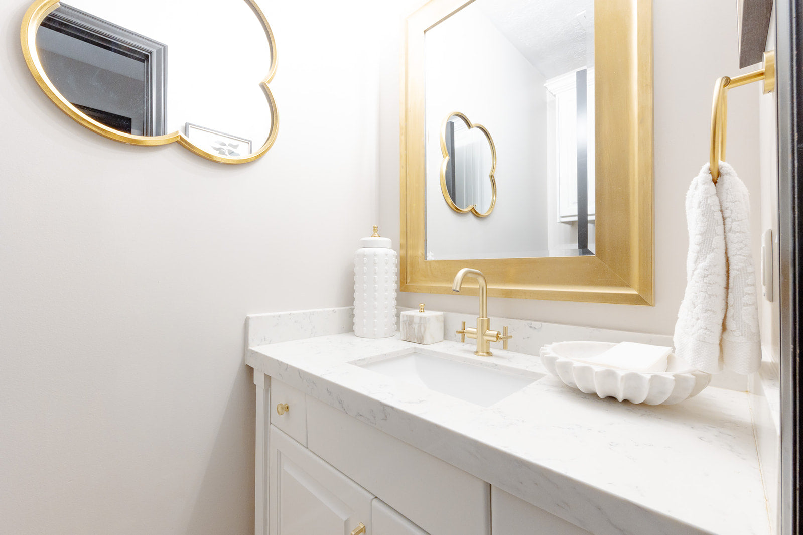
White paint is a design classic—effortless, elegant, and endlessly versatile. Whether you're refreshing a space or starting from scratch, the right white can make a room feel bright and airy, warm and inviting, or crisp and modern. But with countless variations, choosing the perfect white is more complex than it seems.
A well-chosen white never goes out of style, making it one of the most timeless color choices for interiors. However, not all whites are created equal. Undertones, lighting, and finishes all play a role in how a white shade will look in your home.
While I personally love Sherwin-Williams paints and use them in my own home, this guide isn’t about one specific brand—it’s about helping you find the best white for your space, no matter which paint line you prefer. To give a broader perspective, I’ve included some beautiful white paint colors from both Sherwin-Williams and Benjamin Moore.
WHY WHITE IS A TIMELESS CHOICE
White walls have been a staple in interior design for centuries, adapting seamlessly to evolving trends. Here’s why white never goes out of style:
UNDERSTANDING UNDERTONES IN WHITE PAINT
Not all whites are "true" whites. Most have subtle undertones that can dramatically affect how they appear in your space.
No matter the brand, these undertones remain consistent across white shades. Below are some of the best warm, cool, and neutral whites from both Sherwin-Williams and Benjamin Moore.
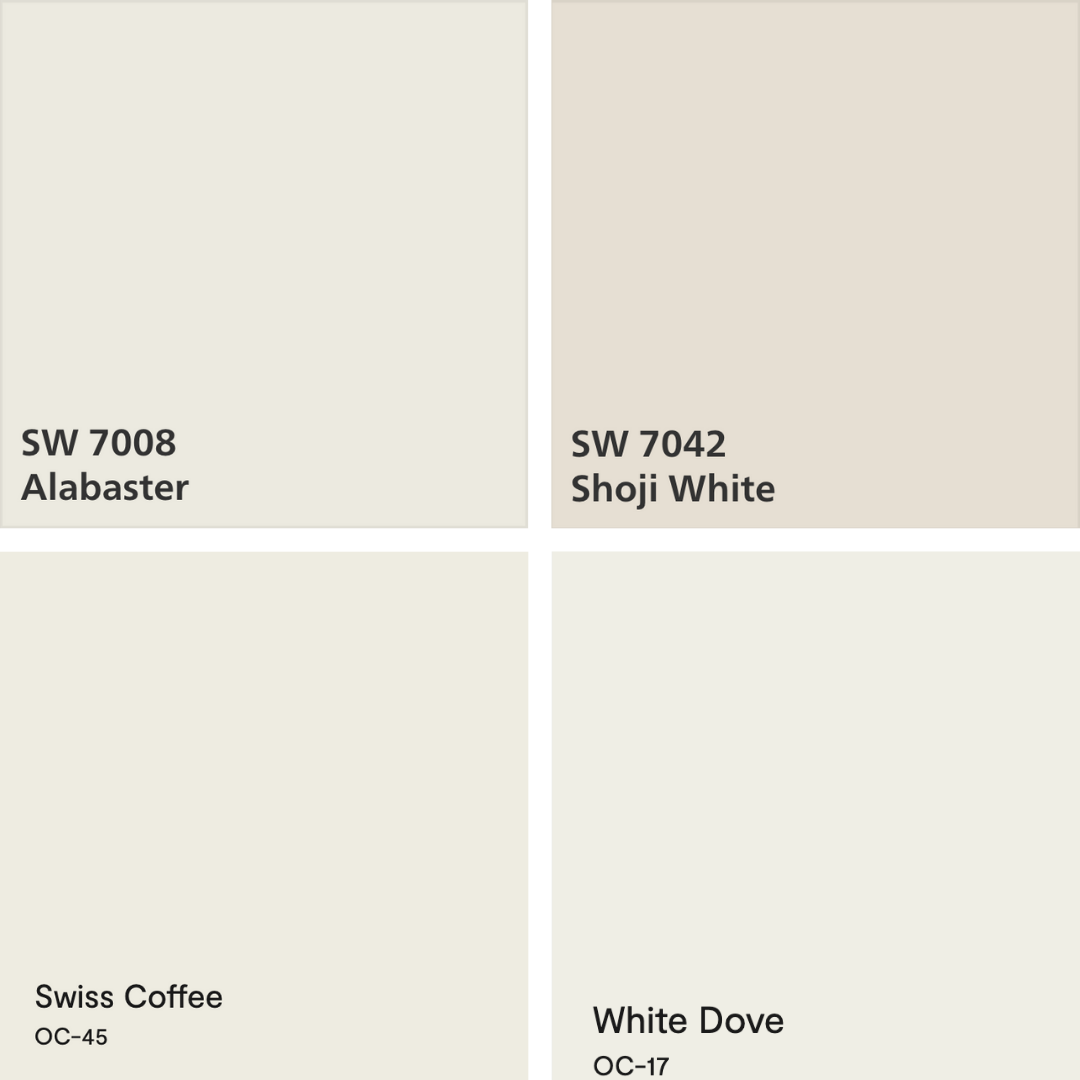
Sherwin-Williams Alabaster (SW 7008) – A soft, creamy white that feels warm without looking yellow.
Sherwin-Williams Shoji White (SW 7042) – A perfect blend of white and greige, making it a great neutral.
Benjamin Moore Swiss Coffee (OC-45) – A beloved, warm off-white that pairs beautifully with traditional and transitional interiors.
Benjamin Moore White Dove (OC-17) – A warm, creamy white with a hint of gray to keep it balanced.
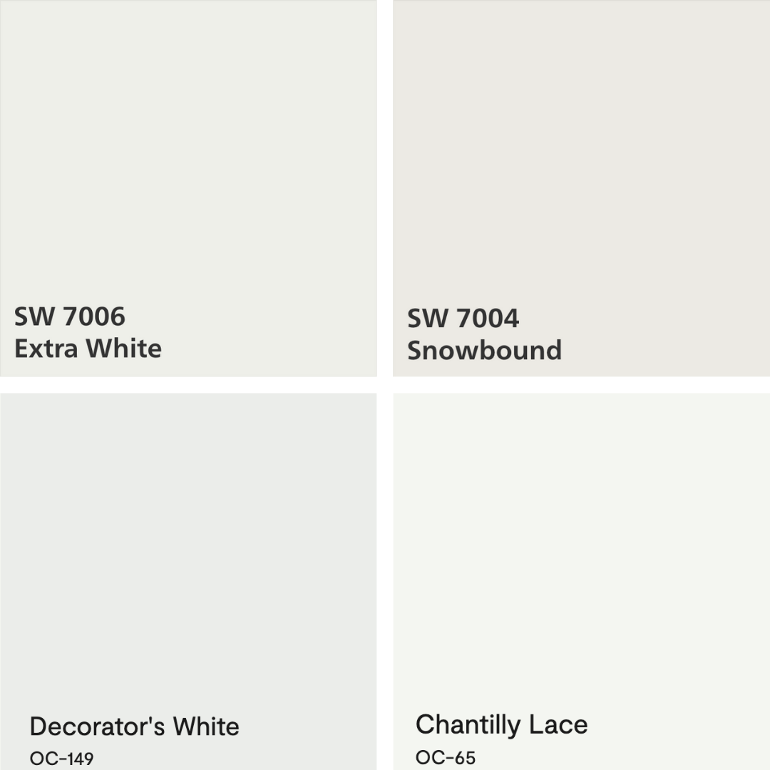
Sherwin-Williams Extra White (SW 7006) – A bright, clean white with a subtle cool undertone, great for modern spaces.
Sherwin-Williams Snowbound (SW 7004) – A cool white with a soft gray undertone that prevents starkness.
Benjamin Moore Decorator’s White (OC-149) – A designer-favorite cool white with a slight gray undertone, great for trim and cabinetry.
Benjamin Moore Chantilly Lace (OC-65) – One of the crispest, cleanest whites, perfect for contemporary and high-contrast designs.
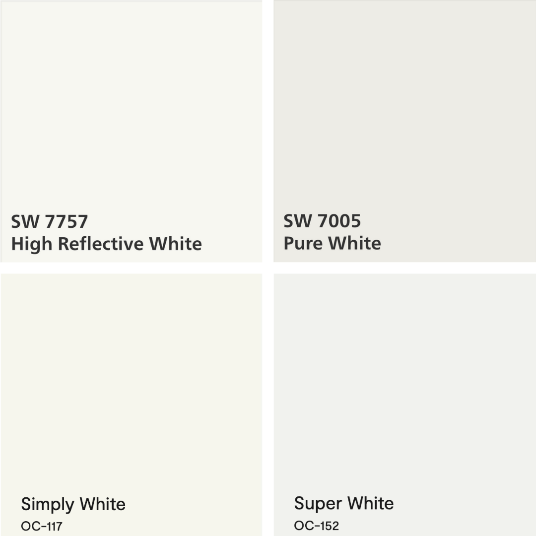
Sherwin-Williams High Reflective White (SW 7757) – One of the brightest, truest whites available.
Sherwin-Williams Pure White (SW 7005) – A soft white with a slight warmth that still feels fresh.
Benjamin Moore Simply White (OC-117) – A versatile white with a touch of warmth, great for walls, trim, and cabinetry.
Benjamin Moore Super White (OC-152) – A neutral, bright white that doesn’t lean too warm or cool, making it highly adaptable.
HOW TO CHOOSE THE RIGHT WHITE FOR YOUR SPACE
1. Consider Your Lighting
2. Look at Your Fixed Elements
3. Always Test First
4. Choose the Right Finish
White paint is a timeless investment in your home’s aesthetic. Whether you prefer a warm and inviting ambiance, a crisp and modern feel, or a neutral backdrop that lets your decor shine, the right white will always stand the test of time.
By understanding undertones and how lighting affects color, you can confidently choose a white that enhances your space, no matter which paint brand you prefer.
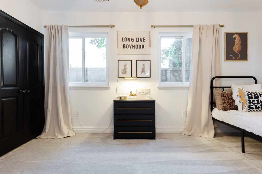
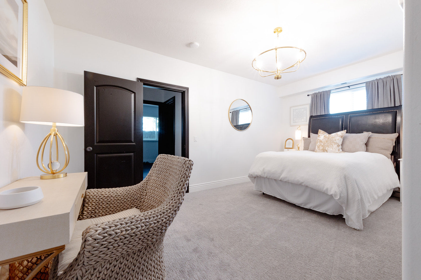
A black-and-white foundation ensures the bedroom remains stylish and age-appropriate for years to come.
Learn more
Scale is one of the most important principles in interior design, yet it’s often overlooked.
Learn moreYour cart is currently empty.
Not sure where to start?
Try these collections:
